A digital-twin platform for Walmart's distribution centres, a live, real-time model of the building where a manager can run a "what if," see how it plays out, and validate the plan in a risk-free sandbox before it ever touches the floor.
Souporno Mukherjee, Information & UX Design · M.Des, National Institute of Design · internship & graduation project at Walmart Global Tech India
Walmart runs one of the largest supply chains in the world. The distribution centre (DC) sits in the middle of it: trailers in, product slotted, orders picked, pallets out, every hour of every day.
I was placed with Walmart US, and the brief sat deep inside DC operations. Every minute of dock time, every mis-slotted pallet, every under-staffed shift costs money downstream. The recurring question was simple to ask and brutal to answer: what's the best way to run this building today?
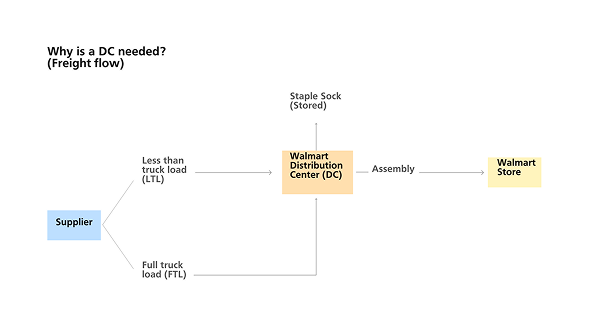
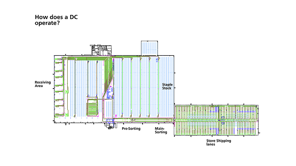
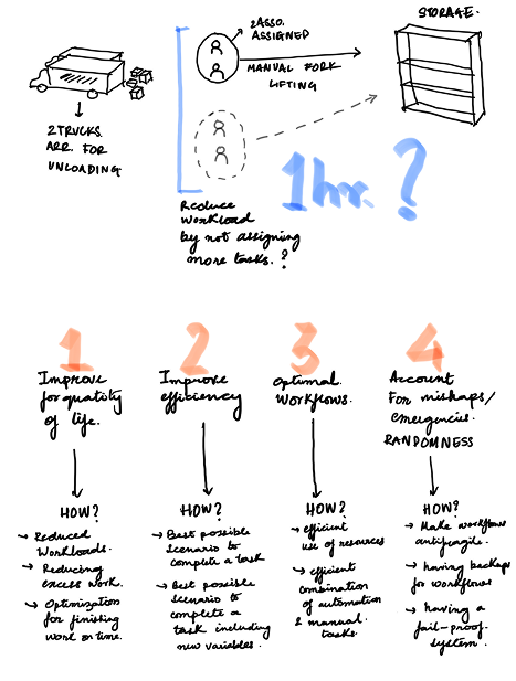
A DC receives freight (less-than-truckload and full-truckload), holds staple stock, assembles and ships to stores. To design for it, I first had to understand how goods actually flow through it.
The product team, managers and engineers pitching this upward, wanted a platform to simulate daily DC operations and optimise the supply chain. "Simulating" meant taking today's live data and all the history, and playing a future scenario forward before committing to it.
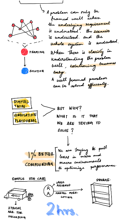
Before drawing anything, I broke down the vocabulary: digital twin, simulation, Monte Carlo. If I couldn't explain those with a metaphor a warehouse manager would nod at, no interface would save the product.
I explained it the way I explained it to the team: with a rocket and a chessboard.
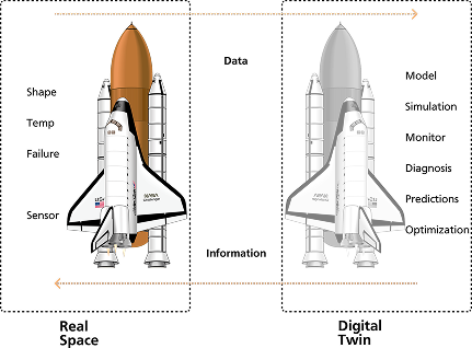
A digital twin is a virtual replica of a physical thing, same shape, temperature, wear, kept in sync by real-time data. On the virtual side you can model, simulate, monitor and predict without risking the real one.
A chess app quietly simulates thousands of futures for every move, then picks the best one. A twin does the same with a Monte Carlo method, running many possible futures to find the best call.
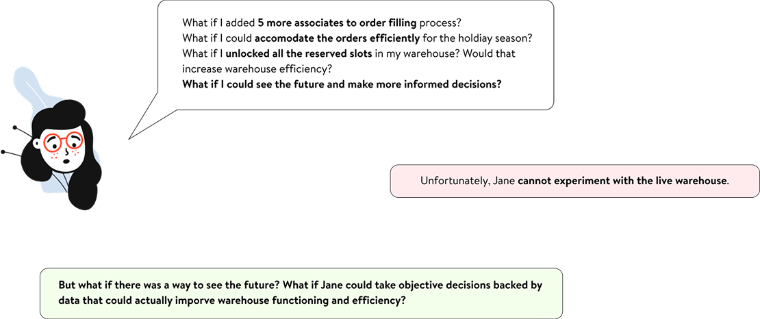
Before drawing screens, I framed the problem. Good framing makes decisions easier and stops the scope from creeping. The platform's job showed up in the questions managers ask every shift:
Each one is a hypothesis waiting to be tested. Treating them as "questions the user wants to ask the future" defined the whole product, and later became its central interaction.

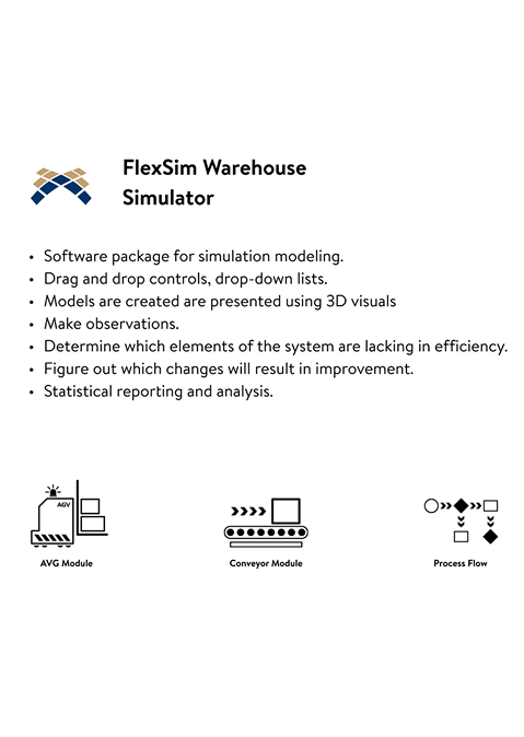
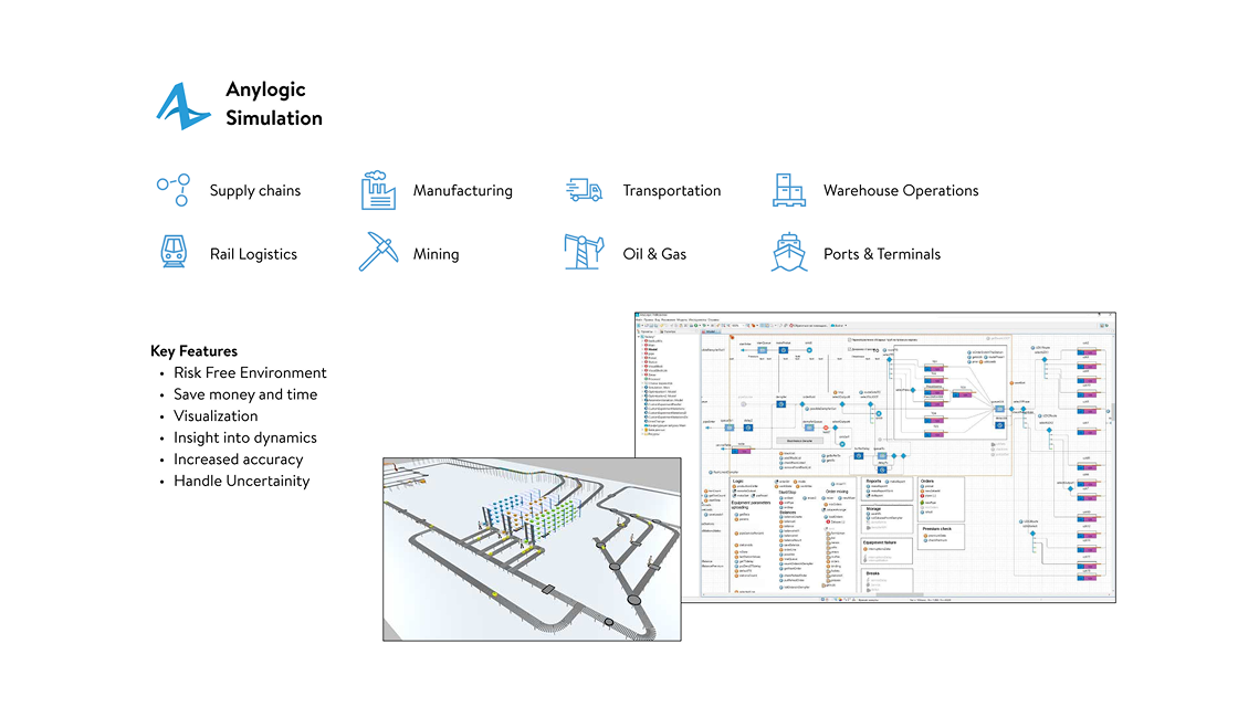
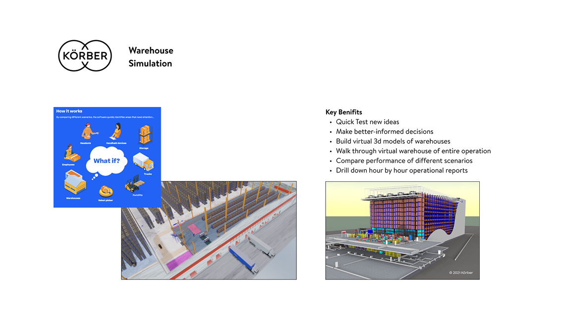
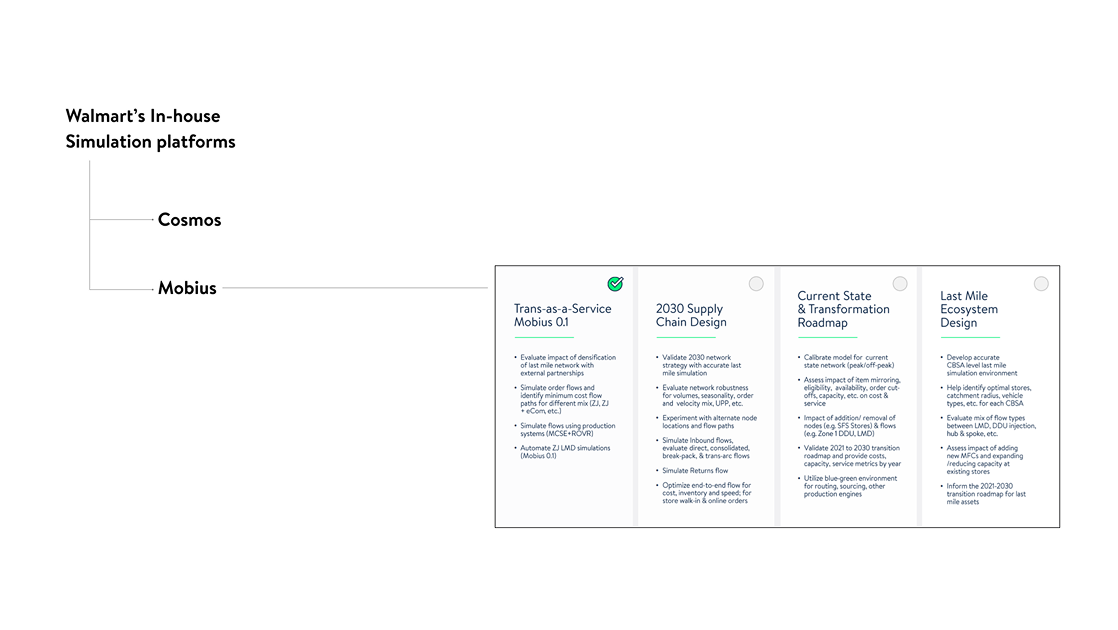
I studied the market and Walmart's own tools. They were powerful and precise, and they all shared one problem: a steep learning curve meant for simulation engineers, not the people on the floor.


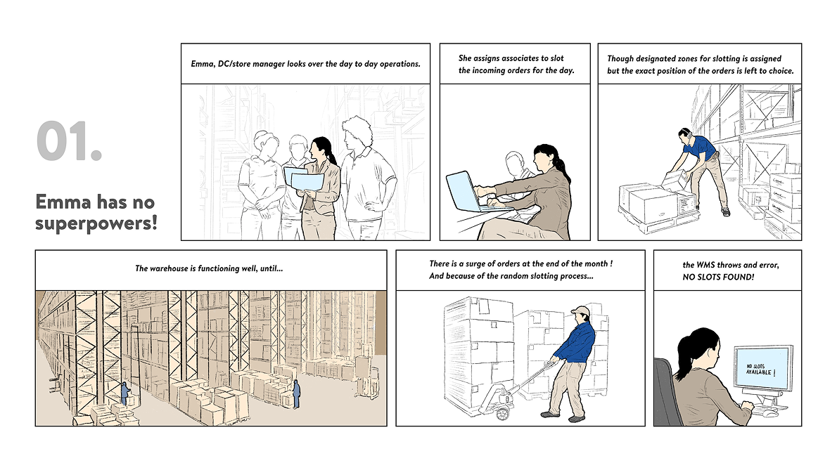
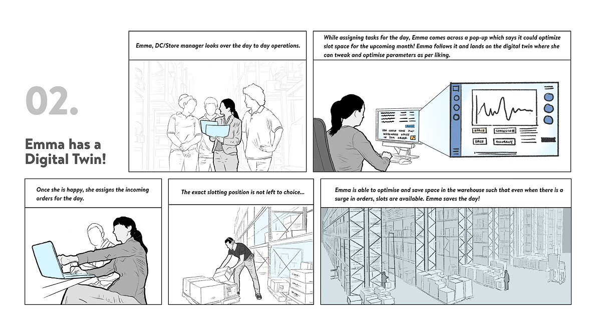
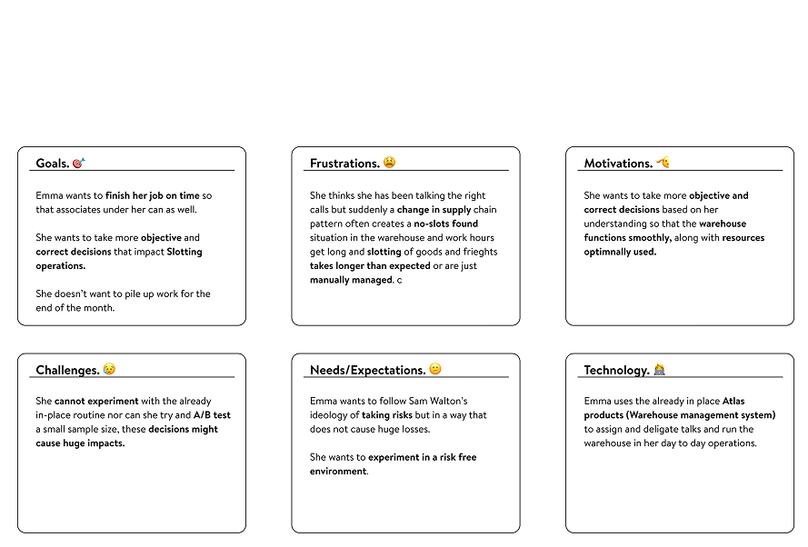
To keep the work honest I tied it to real people, and made the case the clearest way I could: the same manager, one day without the twin, one day with it.


Jane wasn't content to react. She wanted to experiment, to poke at five scenarios in her head and see which one wins. Today that means spreadsheets and waiting on other teams. Her frustration became the question the product had to answer:
"What if there was a way to see the future, to take objective decisions backed by data that actually improve how the warehouse runs?"

An ad-hoc ask landed mid-research: show leadership what this could look like, now.
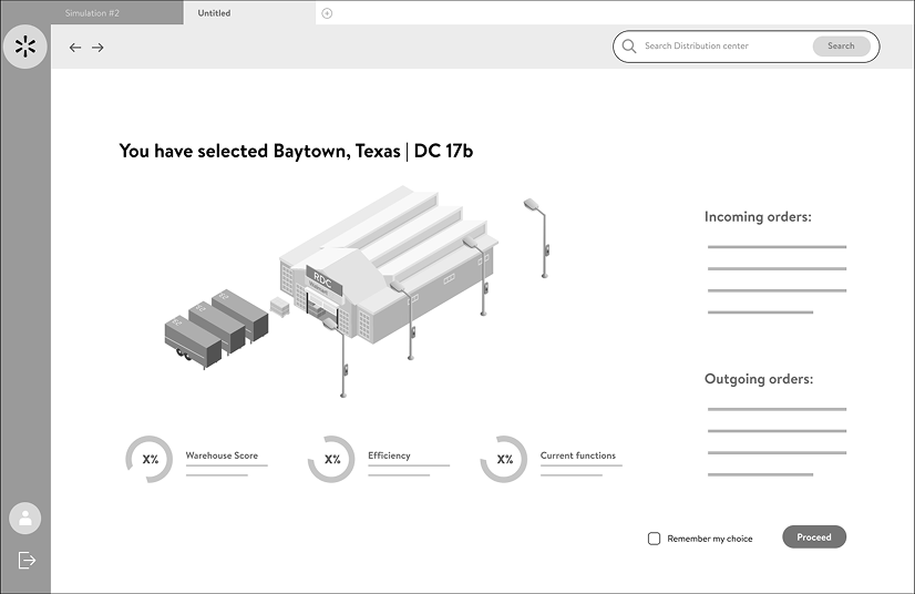
So I zoomed in. Sketching over a line-map of the warehouse, I built an outline, then added an isometric view of the building, a live viewport, and cards suggesting simulations. The first screens got a green light from higher up, and with it, room to redefine the brief and go deeper on research.


With the green light secured, I pulled the whole project onto a single synthesis map. The final shape needed three things: a live viewport, a hypothesis builder, and an outcomes page that optimises the answers.
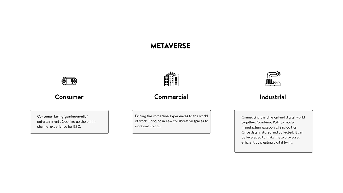
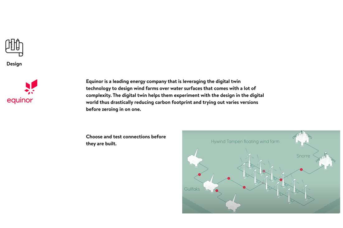
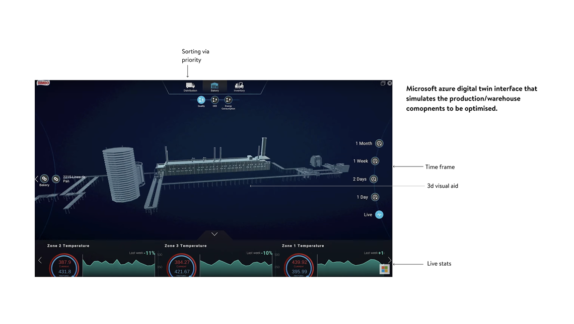
Then Microsoft Ignite put the "industrial metaverse" on stage: digital twins for industry, exactly this area. Equinor, Mercedes and Coca-Cola were already building twins before building the real thing. Seeing that told me the bet wasn't mine alone.


The platform had to be easy to pick up, cover many use cases, and offer both a live view and a simulator view. I ran the whole thing on the Design Council's double diamond, diverging to explore, converging to decide, twice.
The design changed a lot across versions: an isometric first bet, a dark data-dense middle, a calm and legible end. A few turning points:


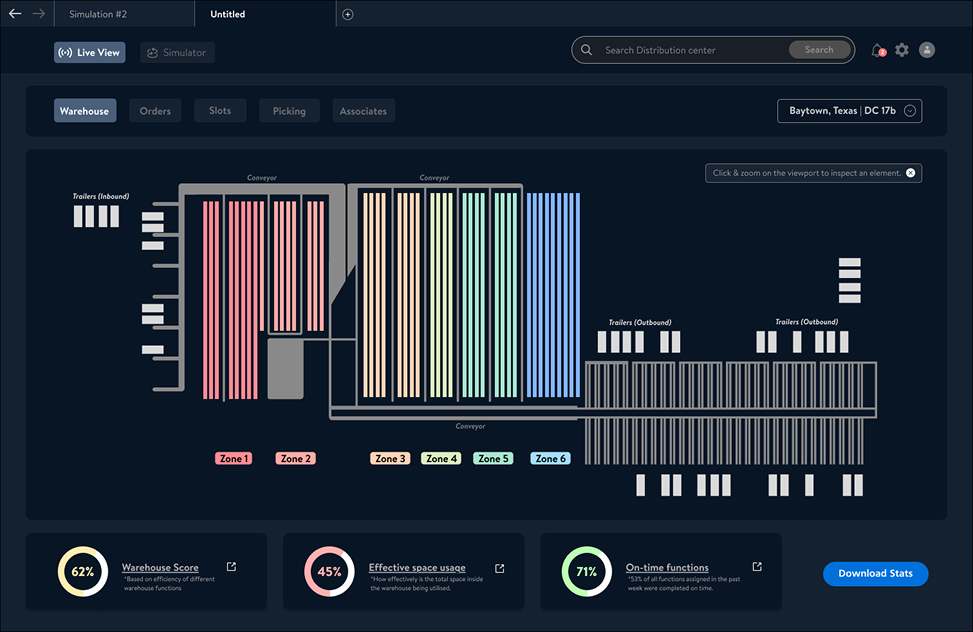
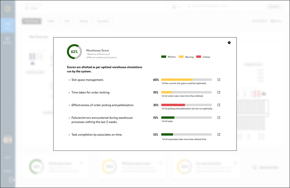
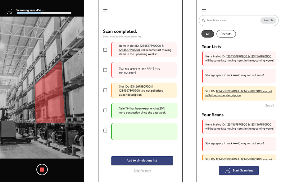
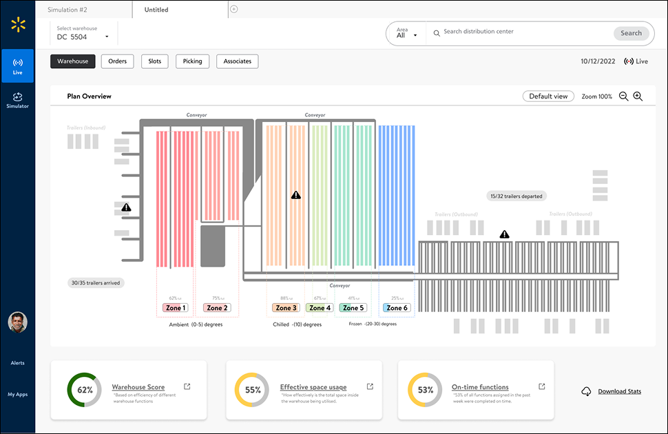
Key moves across versions: splitting Live and Simulator into separate silos so daily work wasn't obstructed; a schematic plan view with colour-coded zones; the Warehouse Score to gamify optimisation; a sidebar and living design elements; and an alternate input, scan a rack with image recognition to seed a hypothesis.

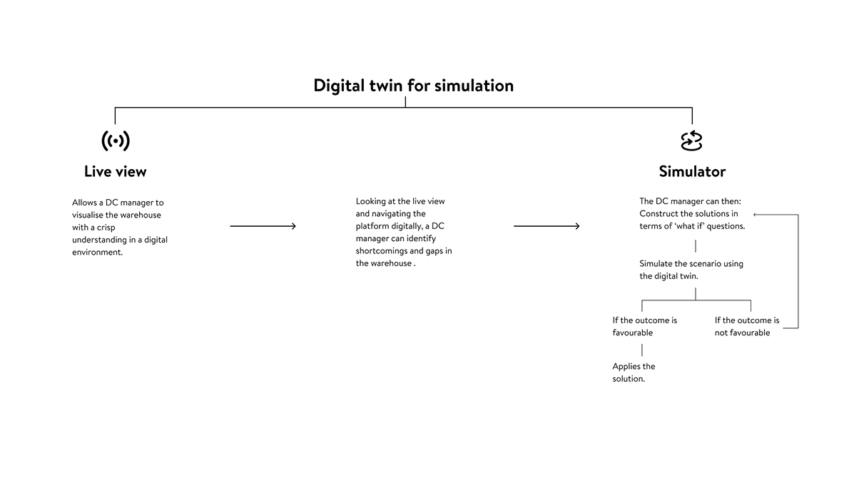
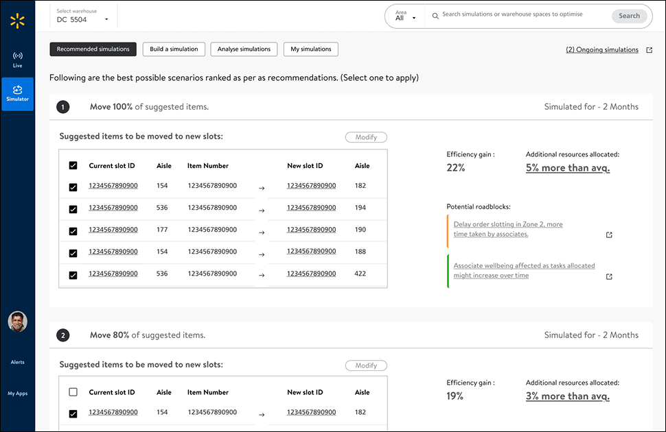
Version 6 settled into two modes: a Live view to see the building at a glance, and a Simulator to try changes before making them. Step through the flow the way a manager would.
Live view, the default screen. Colour-coded zones by temperature, trailer status, and the Warehouse Score, all in one glance.
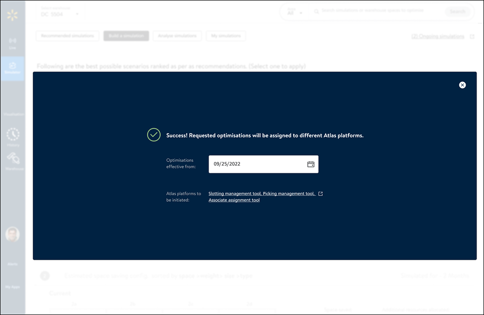
The everyday questions from research become a conversational, fill-in-the-blanks sentence. Ask the future a question in plain language and the system does the rest, testing the decision before it's real. When the outcome looks good, one action pushes it to production.


The concept doesn't stop at a loading dock. The same three parts, a live twin, a plain-language hypothesis builder, an outcomes optimiser, could work anywhere: point them at a store, a transport network, a fulfilment line, and let anyone test decisions before making them.
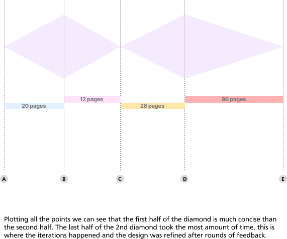
Measuring the process honestly, I plotted the double diamond against the pages it took to document each phase. The back half of the second diamond, iteration and refinement, took by far the most time. The planned process and the real one rarely match, and that's the lesson.